
05 / Mobile banking · Mexico
BALANCE TRANSFER
Make a financial commitment legible before asking for it.
I designed the screens and states that turn a balance-transfer offer into a sequenced journey: available credit, amount, destination card, monthly payment, authorization and receipt.
Outcome: Designed flow · implementation not documented
- Role
- UX / Product Designer
- Contribution
- UI · flows · hierarchy · states
- Inputs
- Research + Product Owners
- Scope
- Mobile credit operation
The challenge
Design a credit decision people can understand before they confirm
A balance transfer is more than entering an amount. People need to identify available credit, understand what they will pay, select a card from another institution and know what happens after they submit their request.
The product challenge was to translate that operation into a mobile sequence that keeps relevant terms visible without overloading every step.
My contribution
Turn product inputs into screens, hierarchy and use states
I used business goals and background supplied by the specialist research area and Product Owners to design the flow UI: selection, entry, calculation, verification, authorization and receipt.
I do not claim the research as my own. My responsibility was to understand the objectives and expected end-user benefits, then translate them into a clear interaction inside the app.
Value proposition
A flow that reveals complexity only when it becomes necessary
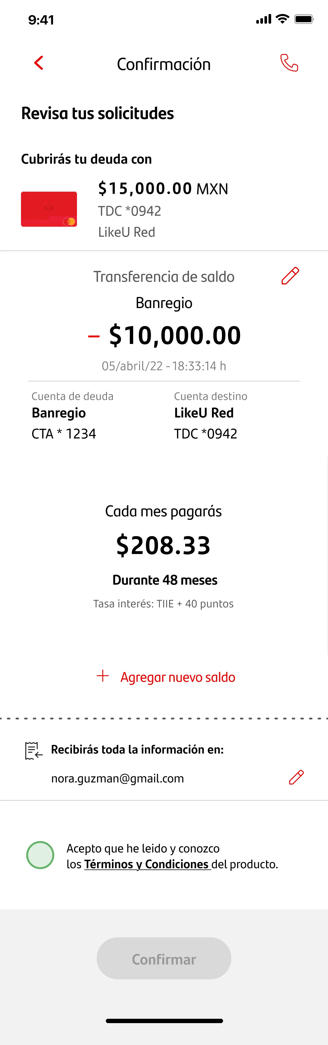
The proposal brings amount, destination card, monthly payment and term together. Confirmation appears only after the relevant information is complete.
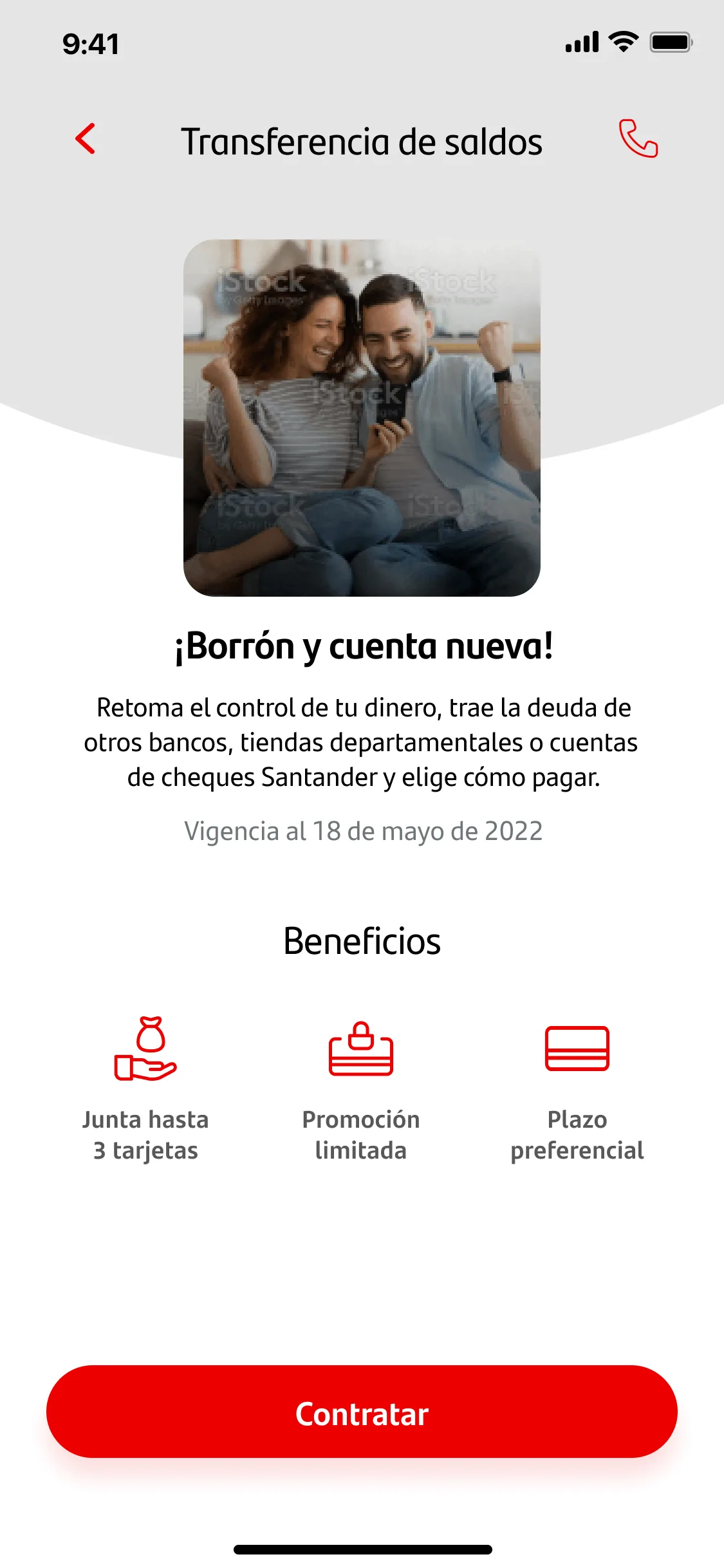
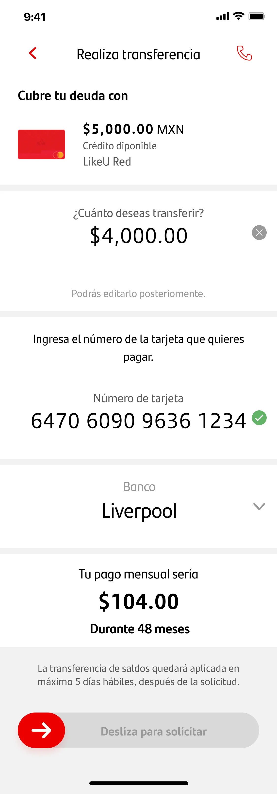
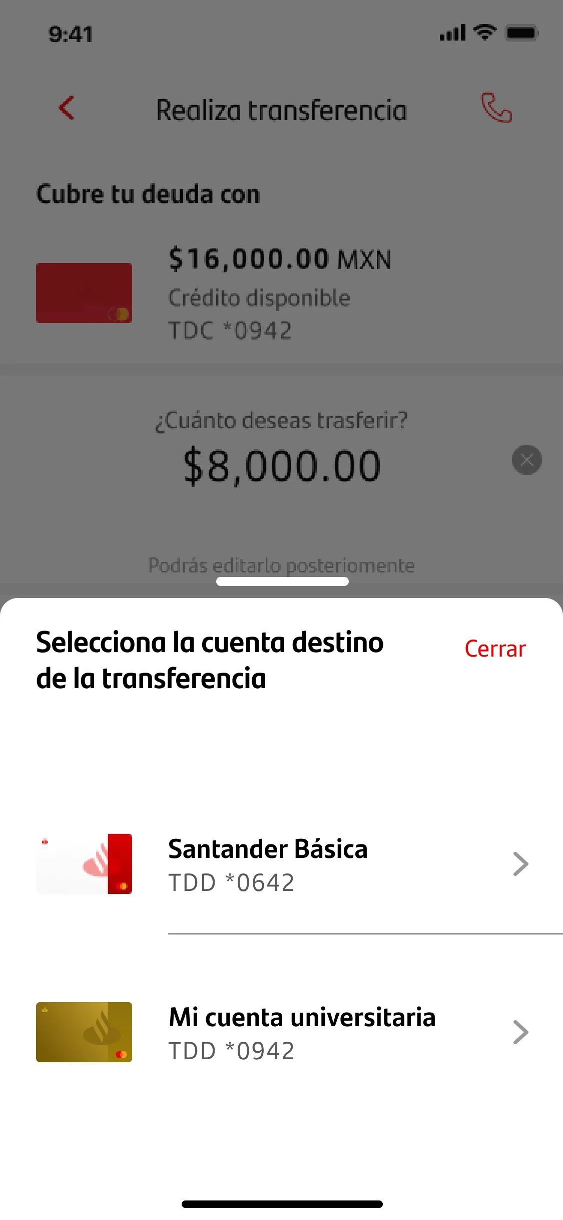
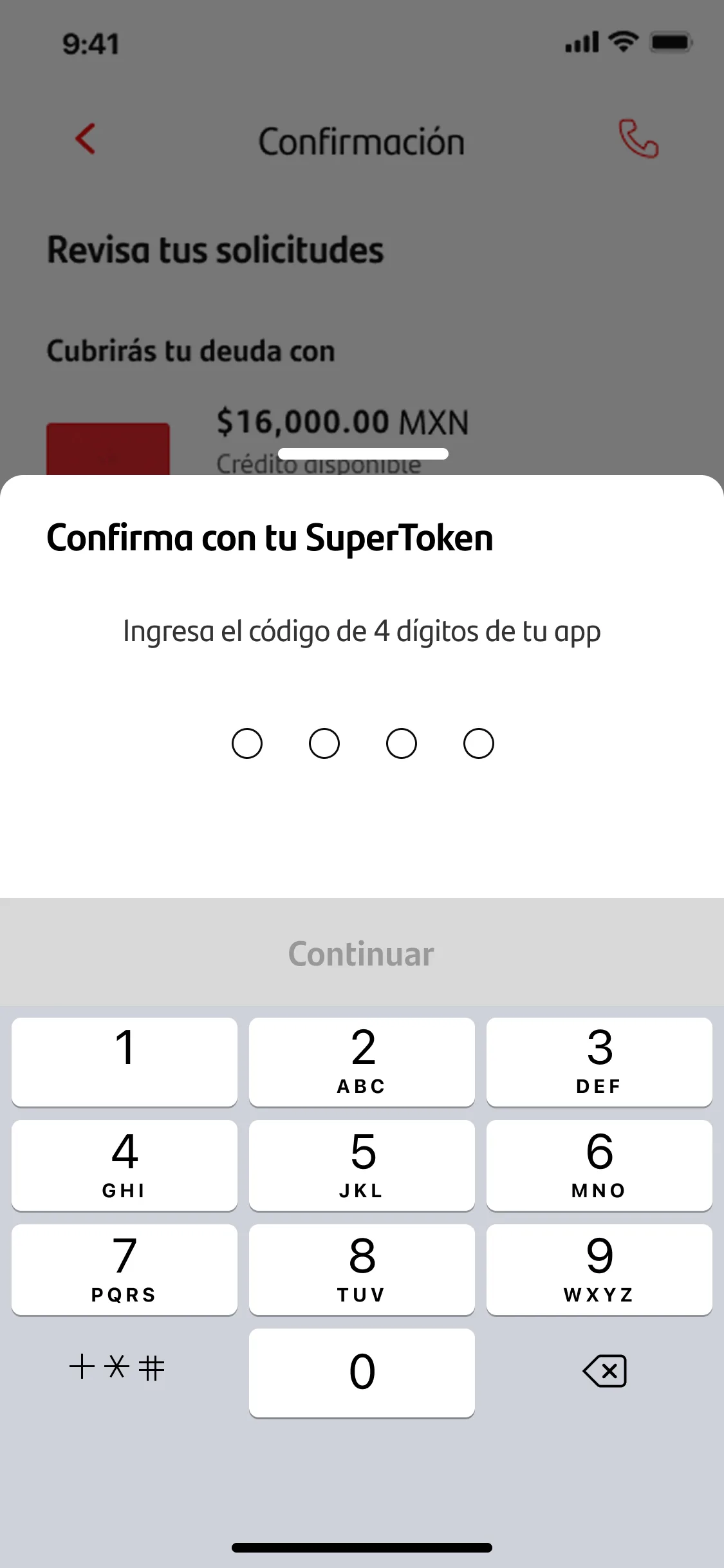
Decisions and evidence
Financial information moves with the person’s level of commitment
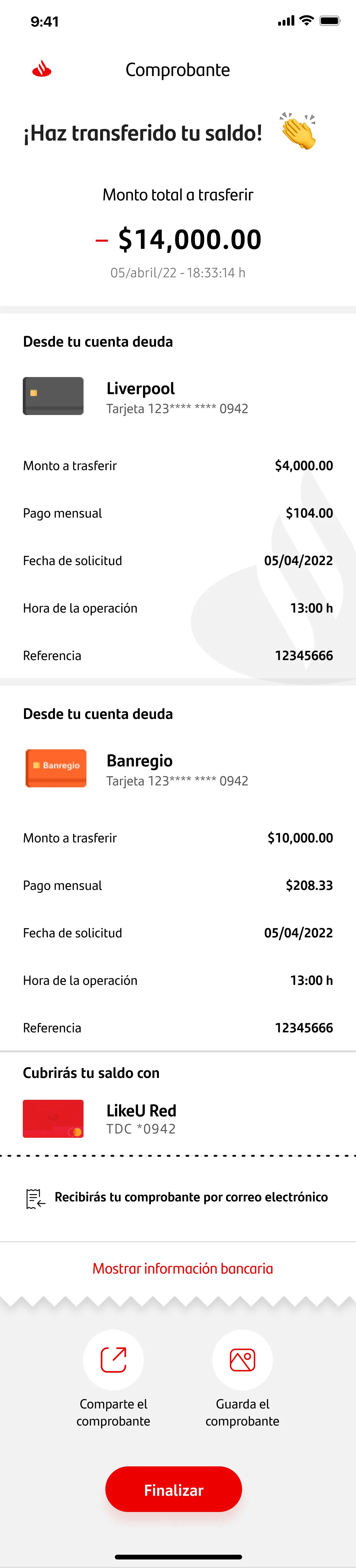
The evidence is organized around each decision moment: offer context, entry, destination-card selection, confirmation, authorization and receipt. Every visual uses sample and anonymized data.
01
OFFER
02
AMOUNT
03
DESTINATION CARD
04
AUTHORIZATION
05
RECEIPT
Impact and scope
A complex operation defined as a complete mobile journey
The verifiable outcome is the designed flow and its Figma screens. No documentation supports claims of conversion, adoption, implementation or business outcomes.
Learnings
In a financial decision, design also explains the commitment
The interface should not request an action before people can anticipate its consequences. Trust is built by ordering the right information before each decision: availability, monthly payment, term and next step.
Boundaries
Documented design, not production outcomes
The screens are selected original mockups from the flow, with sample and anonymized data. Research came from the specialist area and Product Owners; it is not presented as individual authorship. No metrics or launch evidence are available.