02 / Mobile banking · Mexico City · 2023
BX+
Reorganizing the product to align teams and tasks.
I facilitated a workshop with teams across Banco Ve por Más to rethink mobile banking navigation. Together, we turned their input into a shared information architecture and mockups.
Outcome: Architecture and mockups · 2023
- Project
- Banco Ve por Más · mobile banking
- My contribution
- Facilitation + architecture
- Methods
- Workshop, card sorting and collaborative journey mapping
- Year
- 2023
Featured case
The challenge
The challenge: A shared structure for the bank’s offering
Organize banking services and tasks into coherent navigation while incorporating priorities from different teams across the bank.
My contribution
My contribution: Facilitating the conversation and giving it structure
I facilitated the session with bank stakeholders in Mexico City. The group interview and workshop activities made each team’s priorities explicit. I adapted the questions as we worked to connect services with tasks; we then developed the information architecture together and translated it into mockups.
01 · Benchmarking as a starting point
We reviewed other banking apps, including BBVA, to establish shared references before the activities.
02 · Card sorting to organize the offering
We grouped services and tasks to discuss what should stand out and how to organize it.
03 · Mapping journeys together
We mapped journeys live, drawing on the knowledge of the bank’s teams.
04 · From agreements to mockups
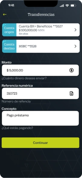
We translated the architecture developed in the session into the project’s screens.
Value proposition
Value proposition: One structure connecting the offering and customer tasks
A shared structure connecting the bank’s offering to customer tasks and turning cross-team agreements into screens.
Decisions and evidence
Decisions and evidence: From card sorting to architecture and screens
Workshop record
Giving key tasks a clear place on Home
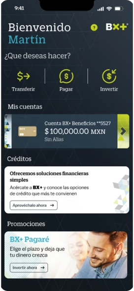
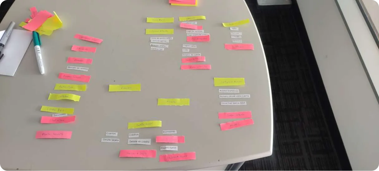
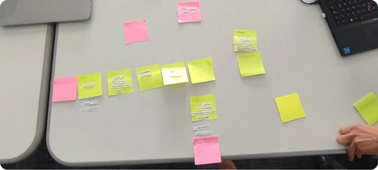
The new structure highlights Transfer, Pay and Invest on Home and groups Profile and Branches under Menu. The original maps show how that reorganization took shape.
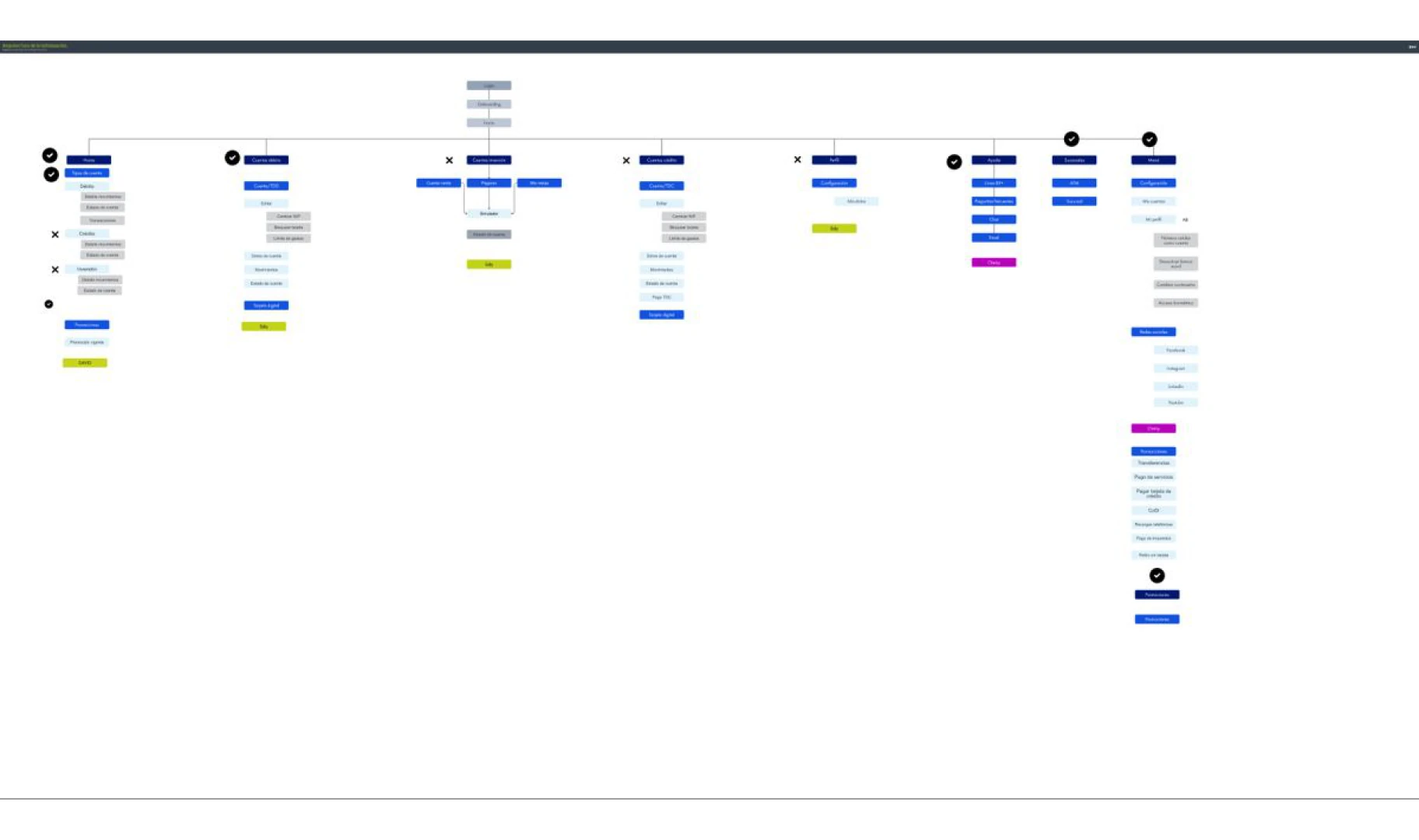
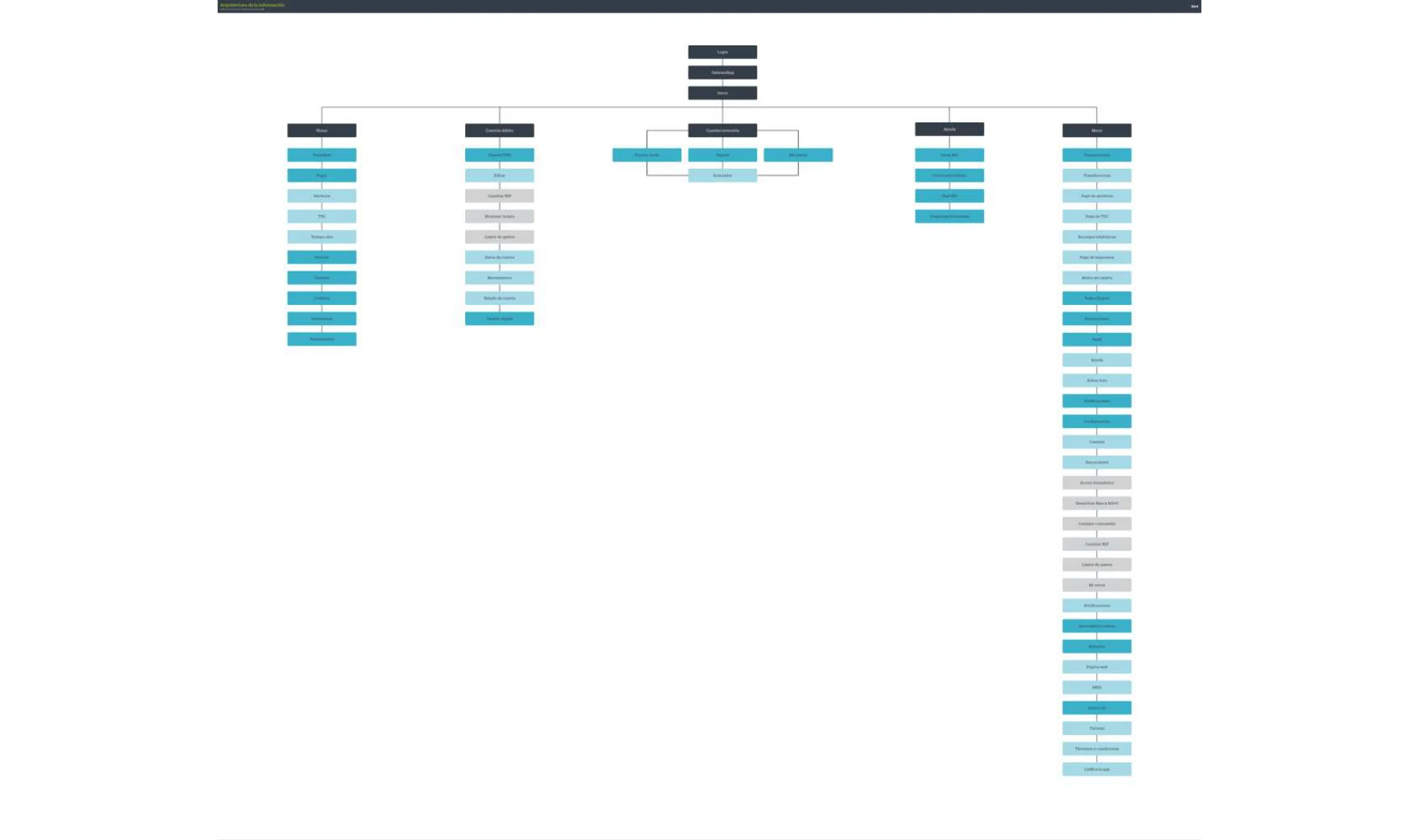
Original maps from 2023 (Spanish). Counts and annotations are an editorial reading of the documents.
The architecture took shape in the screens
The Home mockup presents Transfer, Pay and Invest as prominent shortcuts next to accounts and the bank’s offering: an organizational decision you can follow from the map to the interface.
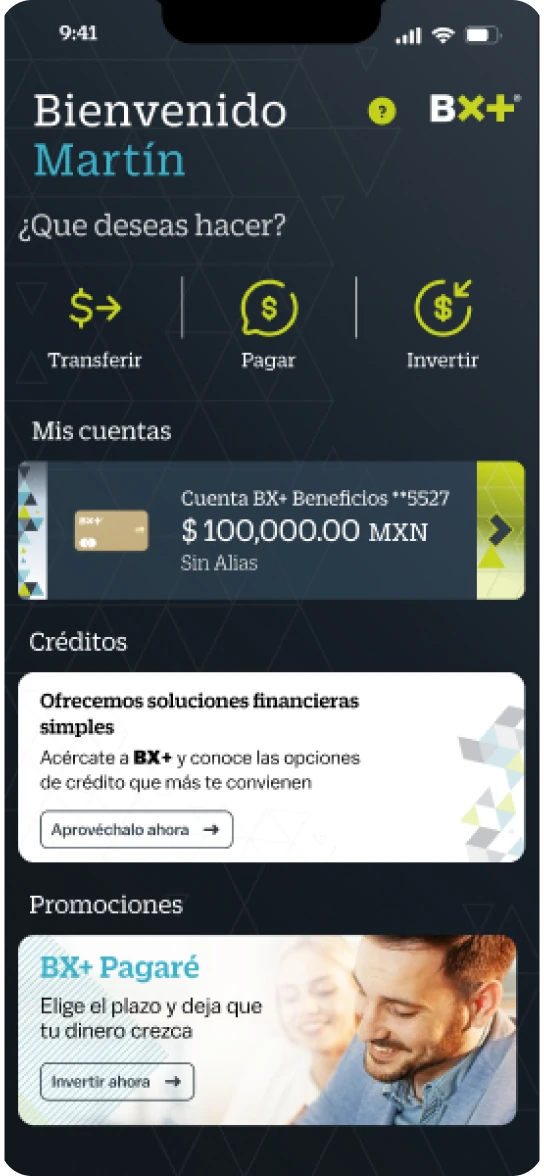
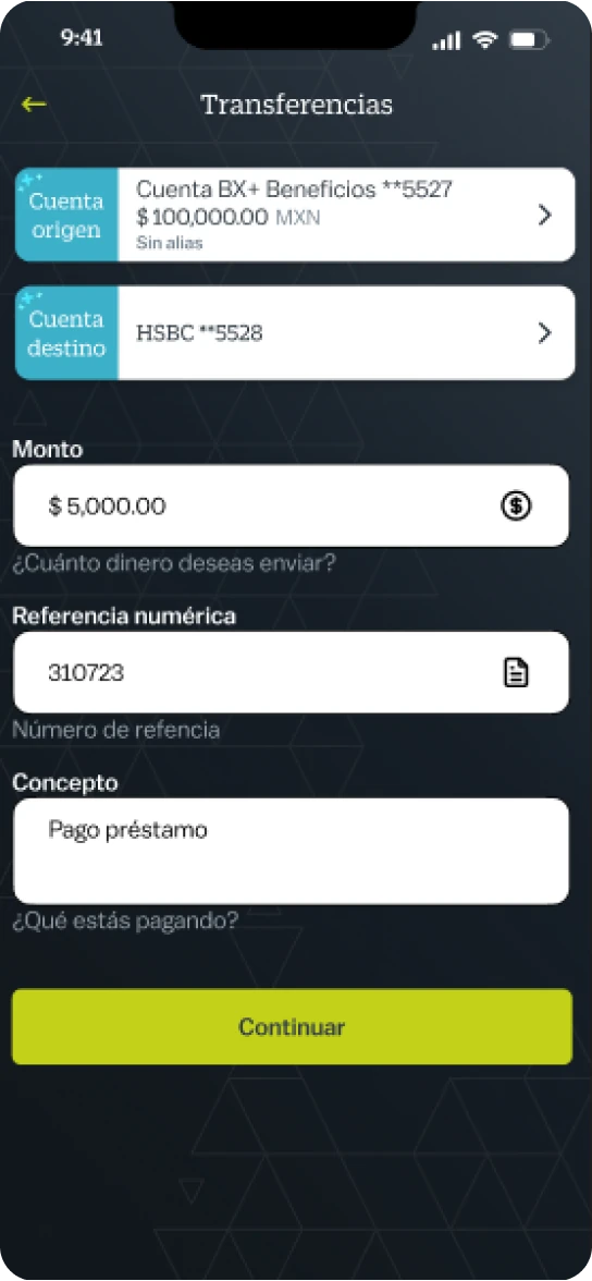
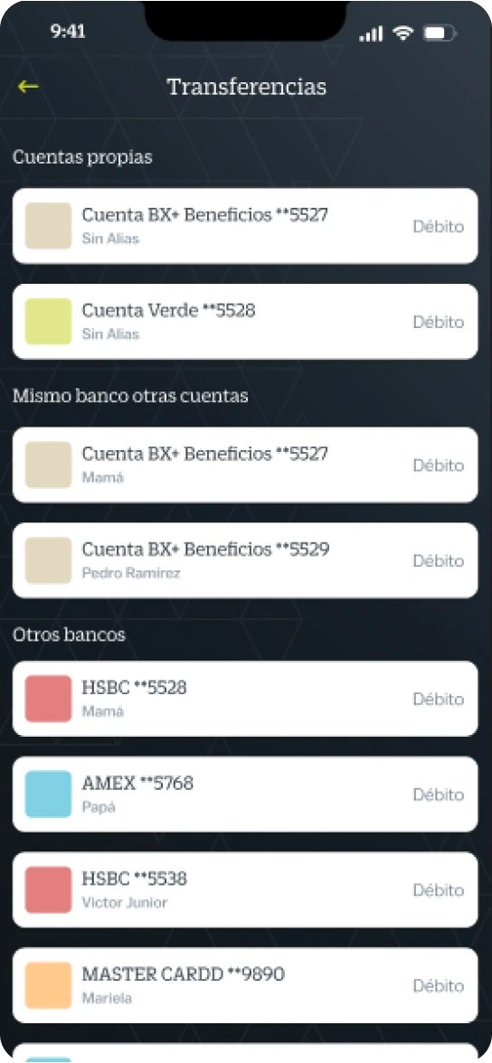
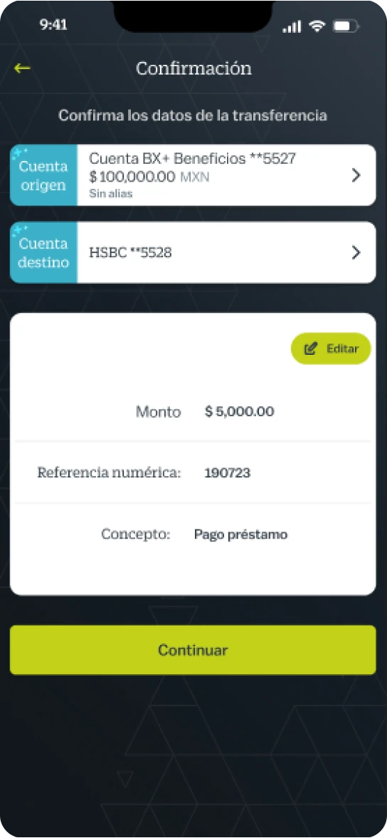
Mobile banking mockups from 2023 developed with the team (Spanish UI).
Impact and actual scope
Impact and actual scope: A shared architecture, translated into screens
The team had a shared structure for turning workshop priorities into navigation decisions. Across the original maps, the structure changed from 8 to 5 top-level branches: Transfer, Pay and Invest became explicit on Home, and Profile and Branches moved under Menu.
Together, we translated that structure into the mobile banking mockups shown in this case.
Learnings
Learnings: Alignment doesn’t replace validation
My main contribution was facilitating the conversation across teams and, together with the team, turning it into architecture and screens.
Cross-team alignment supports a shared architecture, but it doesn’t replace customer validation. Next, I would test comprehension, findability and success on priority tasks.
What can’t be claimedwithout measurement
What can’t be claimed: A documented reorganization, not a measured improvement
- The move from 8 to 5 branches is architecture evidence, not a measured usability improvement.
- No customer testing is documented, and there are no adoption, usage or conversion data linked to this work.
- The case documents the 2023 proposal; it does not establish which parts reached production.